Color Palette by Image

Use color palette by image to turn an uploaded photo, product shot, UI screenshot, room scene, or travel image into a clean downloadable palette report. Seeda AI keeps the uploaded image as the main visual reference, then adds a refined right-side palette card with five large color swatches and simple role labels. The goal is a designer-friendly visual board, not a technical color meter. Start color palette by image when you need a fast mood board for branding, content planning, web design, packaging, social posts, or creative direction.

Create a designer-ready color palette by image

Color palette by image is built for people who want a clear visual palette board from a real image. Upload the reference, keep the image visible, and get a clean report image that can guide brand direction, web styling, product mood boards, and content campaigns.

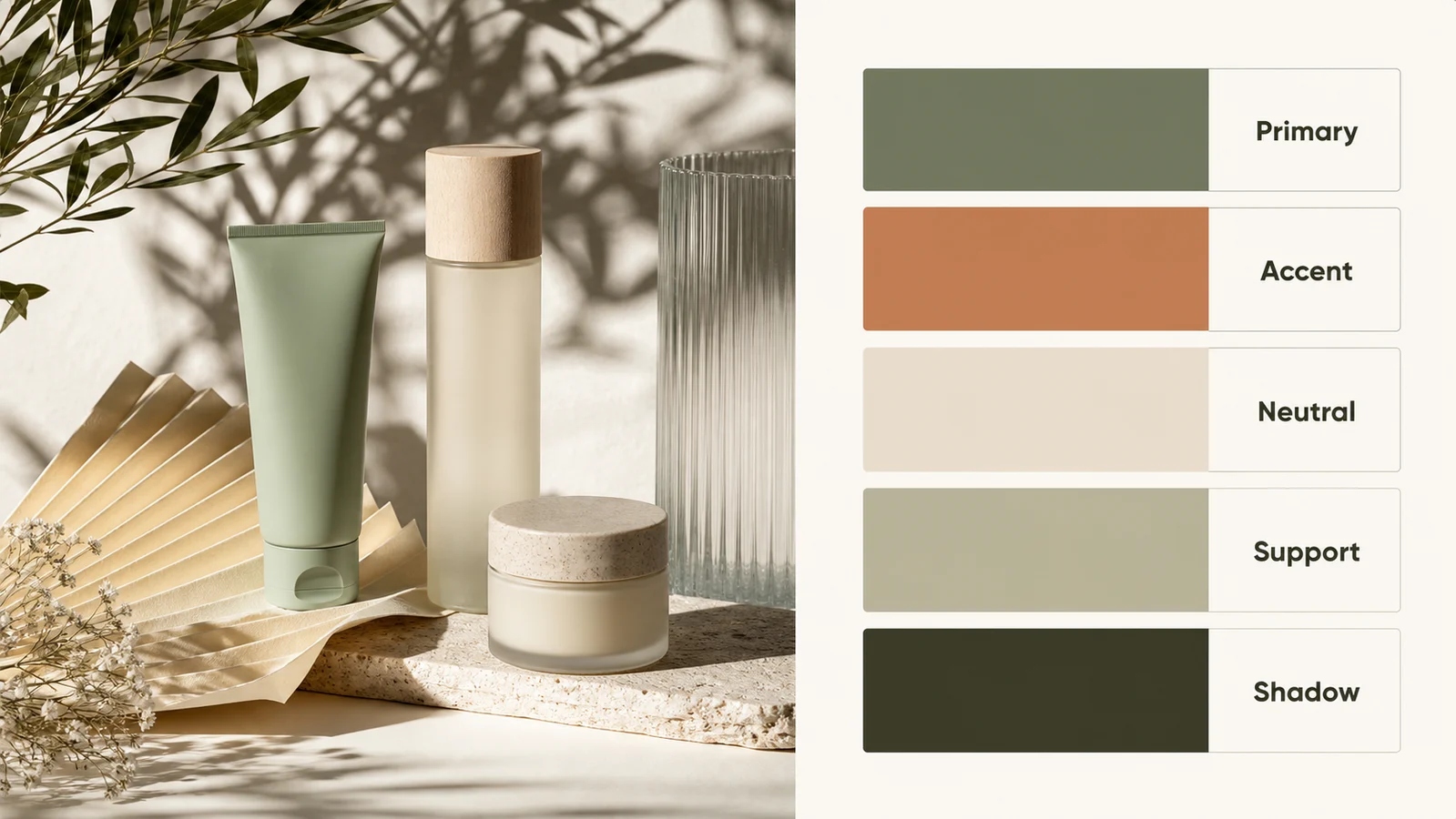
Color palette by image report for product packaging with five visual swatches

Image Upload

Turn any reference into a color palette by image

A useful color palette by image starts with a real source. Upload a portrait, packaging photo, room shot, food image, app screen, travel image, artwork, or campaign reference, then let Seeda AI build a palette report around that source. The output keeps the uploaded image in view so the palette still has context. That matters for creative teams because a swatch alone can feel abstract; color palette by image makes the relationship between the image and the palette visible. Use it when you want a shareable visual report for a brand deck, style guide, client review, social mood board, or design sprint.

Upload imagePalette reportMood board
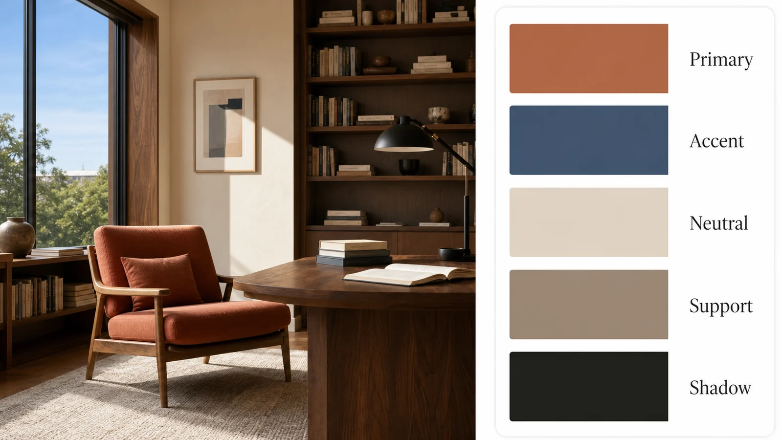
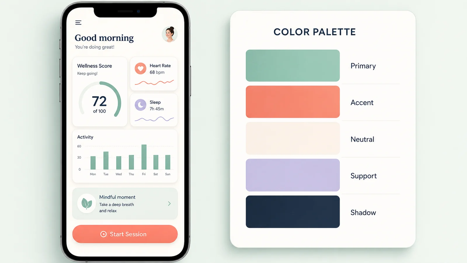
Color palette by image for an interior design scene with role-labeled swatches

Five Swatches

Use visual roles instead of fragile color values

This color palette by image workflow focuses on broad visual roles: the primary color that anchors the reference, an accent that adds energy, a neutral that keeps the composition usable, a support color that extends the range, and a shadow color that gives depth. That approach is better suited to AI image generation than pretending the text inside a generated image can be a perfect technical reading. For precise production specs, designers can sample the final image in their own tool. For fast direction, color palette by image gives the visual story first.

PrimaryAccentNeutral
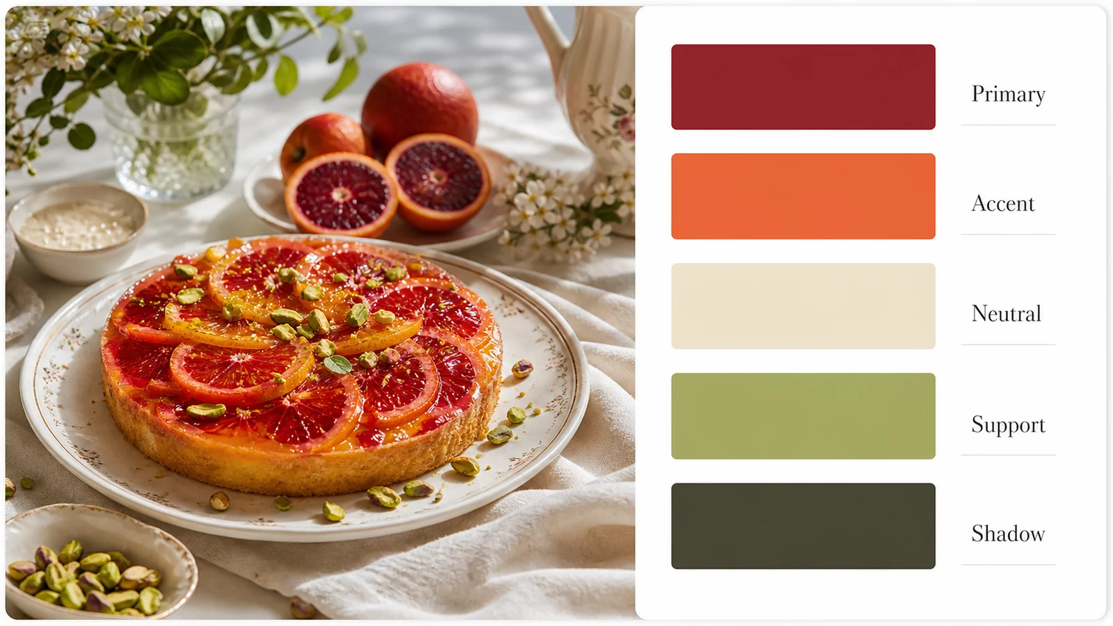
Color palette by image report for food photography with five clean swatches

Downloadable Report

Export a polished palette image for creative direction

Color palette by image is useful because the result is already presentation-ready. Instead of copying a loose set of colors into another document, you can download one clean report image that shows the source and the palette together. Put it in a brand board, product planning doc, landing page brief, ad concept, campaign folder, or client note. When the same team needs to discuss mood, contrast, warmth, softness, and visual hierarchy, color palette by image gives everyone a compact reference they can review quickly.

DownloadBrand boardCreative brief
Workflow

How to create a color palette by image

The best color palette by image workflow is simple: upload a strong image, keep the report format clear, then download the palette board for design and content planning.

1

Upload your reference image

Start color palette by image with the source that already has the mood you want. A product photo, home interior, fashion look, artwork, UI screenshot, food image, or travel scene can all work. Clear lighting and a focused subject usually create a more useful palette report.

2

Keep the palette card on the right

Use the default color palette by image prompt when you want a report with the original image on the left and five visual swatches on the right. This gives the result a clean, consistent format that is easy to compare across multiple references.

3

Review the visual color roles

Read the palette as a direction board. Primary, Accent, Neutral, Support, and Shadow help you discuss the role each color plays without relying on fragile generated technical text. Color palette by image works best as visual guidance for creative decisions.

4

Download and use the report

Save the generated report and place it in your brand deck, campaign folder, product brief, UI exploration, social plan, or client review. Color palette by image keeps the source and palette together so the creative intent stays easy to understand.

Color palette by image ideas for design teams

Use these color palette by image directions when you want the output to feel like a professional visual report instead of a raw extraction screen.

Color palette by image FAQ

Common questions about using color palette by image for design, branding, product, content, and creative planning.


Create a color palette by image report

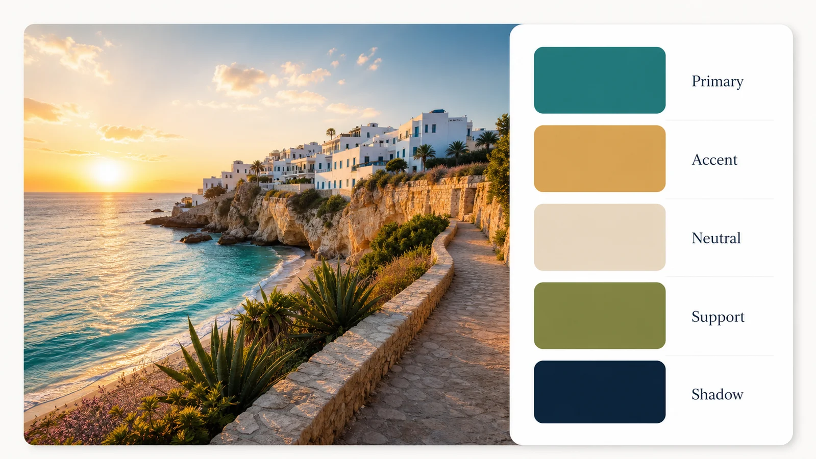
Upload a reference image and generate a clean palette report with five large visual swatches on the right.